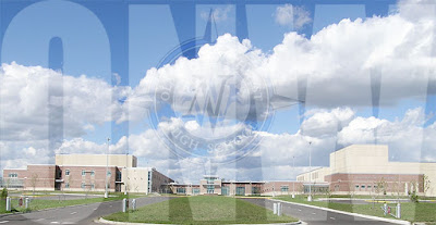
I made this in Photoshop by following a tutorial. The tutorial taught me how to resize things properly, make things slightly transparent, and remove the white background from images. Photoshop is pretty different from Illustrator, Illustrator uses vectors but Photoshop is just pixels. That means you have to be more careful in Photoshop with your image scaling, if you scaled up a small picture to be bigger, it would be all pixelated, but in Illustrator, it would make more pixels. Both programs are useful in their own ways, you just have to know when to use them.
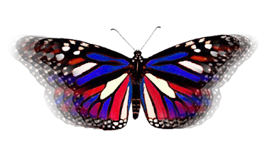
I made this butterfly in Photoshop using the clone stamp tool. I didn't understand how it worked at first, but after it was explained to me it makes sense, it seems like a useful tool. I don't think they have this tool in Illustrator, so that's a difference between the two.
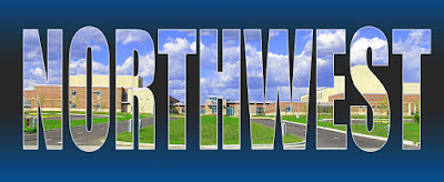
I learned how to use the gradient tool, the text mask tool, and how to add strokes to the outline of a picture. Using all of those, I made this banner with a picture of the front of the school behind the letters, I also increased the saturation on the photo because I thought it looked nice.
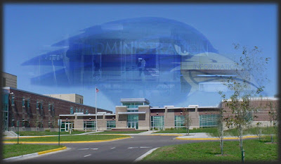
For my last Photoshop project, I used most of what I learned to make this. I copied the raven's head from the mural in the gym, pasted it on the picture of the school, lowered the opacity and added a soft light blend. Then I took pictures from around the school and applied layer masks to them to make them fade out around the edges and slightly transparent as well. This project used most of what I had learned about Photoshop and I think it turned out well.
 I made this in Photoshop by following a tutorial. The tutorial taught me how to resize things properly, make things slightly transparent, and remove the white background from images. Photoshop is pretty different from Illustrator, Illustrator uses vectors but Photoshop is just pixels. That means you have to be more careful in Photoshop with your image scaling, if you scaled up a small picture to be bigger, it would be all pixelated, but in Illustrator, it would make more pixels. Both programs are useful in their own ways, you just have to know when to use them.
 I made this butterfly in Photoshop using the clone stamp tool. I didn't understand how it worked at first, but after it was explained to me it makes sense, it seems like a useful tool. I don't think they have this tool in Illustrator, so that's a difference between the two.
 I learned how to use the gradient tool, the text mask tool, and how to add strokes to the outline of a picture. Using all of those, I made this banner with a picture of the front of the school behind the letters, I also increased the saturation on the photo because I thought it looked nice.
 For my last Photoshop project, I used most of what I learned to make this. I copied the raven's head from the mural in the gym, pasted it on the picture of the school, lowered the opacity and added a soft light blend. Then I took pictures from around the school and applied layer masks to them to make them fade out around the edges and slightly transparent as well. This project used most of what I had learned about Photoshop and I think it turned out well.


