Responsive design in websites is when the website you're viewing adjusts to the screen size in order to convey the message most effectively across devices. The amount of people viewing websites on mobile devices is increasing, so now it's important to account for desktop and mobile users. The best way to do this in web design is by using media queries. Media queries can be used to apply certain CSS styles only when the viewing width of the page fits within the limits of the media query. When developing a responsive design, you have to pay attention to breakpoints. You can find breakpoints by slowly decreasing your window's width until the elements on the page don't look like they should. This is where you insert a media query. By continuously finding and fixing breakpoints, you can make a website responsive.
This is a screenshot from the laptop version of Papa John's site. This screenshot has the most information on the page as possible.

When shrunk down to the tablet size, the site retains most of the same elements. One change is the removal of the promo code bar and the reduced size of the shopping cart button.
Finally, the smallest version has a hamburger menu which you can expand to see the remaining navbar content. The splash content was also reorganized to move the text under the picture instead of covering it in order to use the space most effectively.
 On the desktop version of my website, we can see that the text on my splash page takes up about a third of the screen width. This looks really nice when viewed on a larger screen, but if it were to take up a third of a smartphone screen, it may become hard to read.
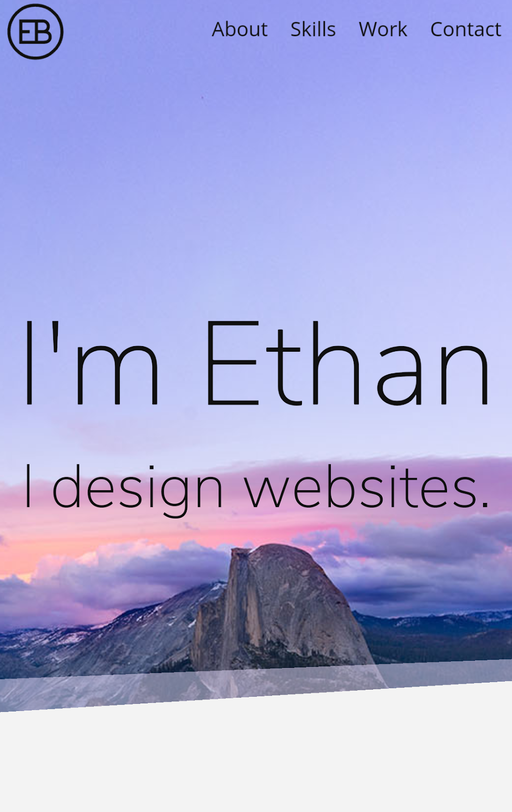


