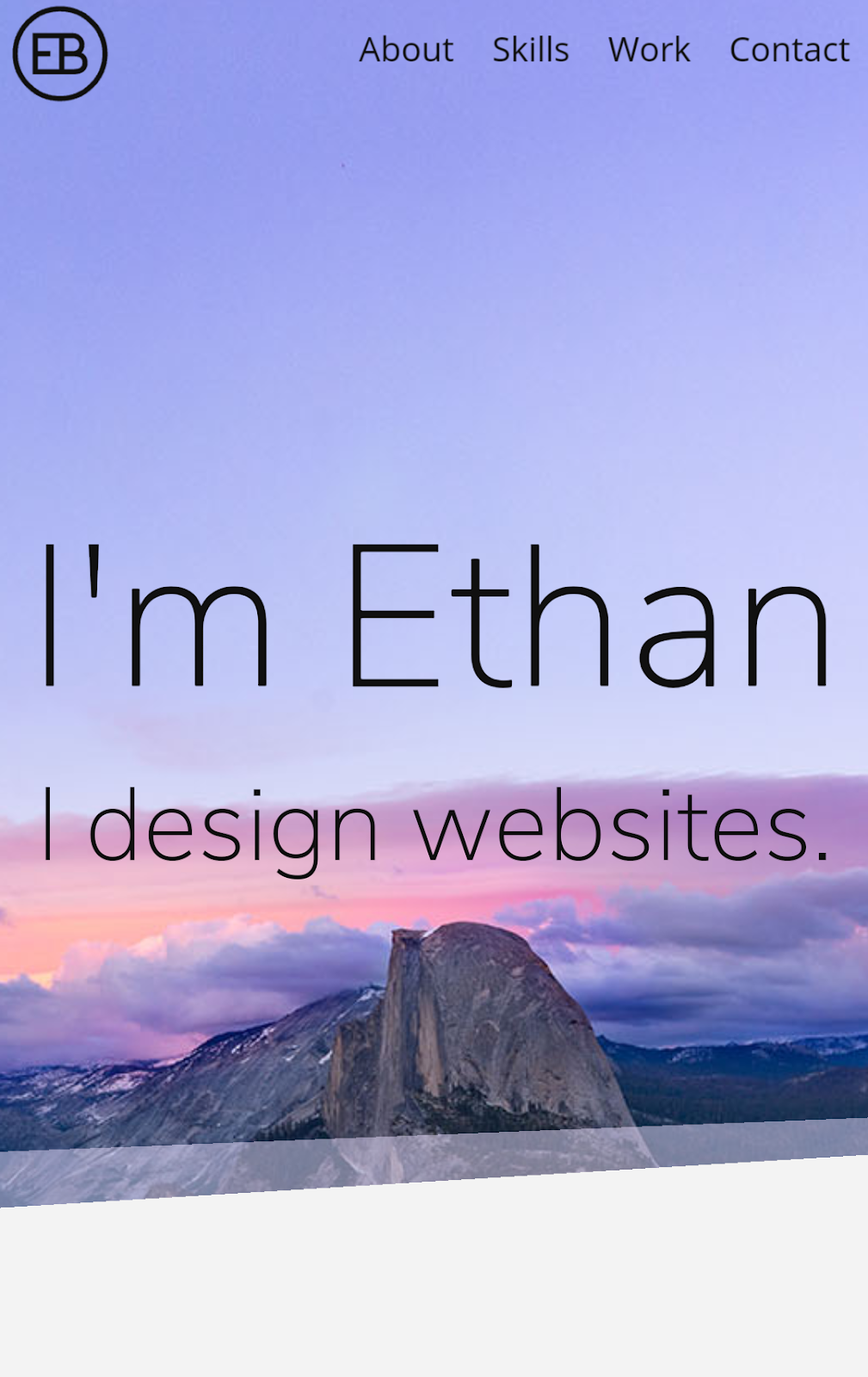
By using media queries, I changed the text so that it would use nearly 100% of the screen width. This works well on a small screen, but if it took up a 100% on desktop, it would be annoying to read.
Tuesday, April 4, 2017
Responsive Design Overview
Responsive design is the practice of making your website adjust to the varying screen sizes of the website's viewers. This is important because people use their phones as much as they use full sized computers. Viewing a website designed for a different screen size can hurt the website's functionality by making it harder to read or use. I incorporated responsive design into my website in order to make it more usable on mobile. I did this by making the text larger relative to the screen on smaller screen. In addition, I made the array of projects have fewer columns on smaller screens.
On the desktop version of my website, we can see that the text on my splash page takes up about a third of the screen width. This looks really nice when viewed on a larger screen, but if it were to take up a third of a smartphone screen, it may become hard to read.
Sunday, April 2, 2017
Responsive Design
Responsive design in websites is when the website you're viewing adjusts to the screen size in order to convey the message most effectively across devices. The amount of people viewing websites on mobile devices is increasing, so now it's important to account for desktop and mobile users. The best way to do this in web design is by using media queries. Media queries can be used to apply certain CSS styles only when the viewing width of the page fits within the limits of the media query. When developing a responsive design, you have to pay attention to breakpoints. You can find breakpoints by slowly decreasing your window's width until the elements on the page don't look like they should. This is where you insert a media query. By continuously finding and fixing breakpoints, you can make a website responsive.
This is a screenshot from the laptop version of Papa John's site. This screenshot has the most information on the page as possible.
Finally, the smallest version has a hamburger menu which you can expand to see the remaining navbar content. The splash content was also reorganized to move the text under the picture instead of covering it in order to use the space most effectively.
Thursday, March 23, 2017
Marks and Symbols
In the world of graphic design, marks are used frequently. There are different classifications of marks, and we learned how to distinguish between them today. The first type of mark is the symbol. Symbols are marks without type that identify a group and can be legally protected. These make a quick impact, however they have to be explained due to the lack of type explaining the mark. Pictographs are public symbols able to be used by all. These are often associated with public safety. Lettermarks are letters used to identify a company that aren't pronounceable. These are often shortened versions of a longer name. Logos are words that represent a company but are pronounceable. Combination marks are a combination of a symbol and logo, also called signature. Finally,we have trademarks. All of the previously mentioned marks qualify to be trademarks. Trademarks are the legal name for unique mark. These can be registered and protected by the law.
The difference between a symbol and a logo is that a logo uses type to represent a company, and a symbol represents the company without any type. When the two of these are used together, a combination mark is created.
I learned that there is a difference between a logo and symbols. I had never paid any attention to the distinguishing factors between these. I also had never realized that lettermarks were separate from logos as well. In addition, pictographs were new to me. I didn't know that there were separate names for symbols not protected by the law.
My favorite thing I learned would just be learning the classifications in general. I feel like this would be useful when working with clients and designing the right type of mark for them.
The difference between a symbol and a logo is that a logo uses type to represent a company, and a symbol represents the company without any type. When the two of these are used together, a combination mark is created.
I learned that there is a difference between a logo and symbols. I had never paid any attention to the distinguishing factors between these. I also had never realized that lettermarks were separate from logos as well. In addition, pictographs were new to me. I didn't know that there were separate names for symbols not protected by the law.
My favorite thing I learned would just be learning the classifications in general. I feel like this would be useful when working with clients and designing the right type of mark for them.
Thursday, February 9, 2017
Flash
In it's prime, Flash helped give life to the websites we visited. Instead of just a GIF or flashing text, you could make your website much more interactive. The use of this plugin would ensure that a website would load exactly the same way for everybody who visits the page. With Flash, we saw the beginning of web based video, animations, and games.
When the first iPhone was announced in 2007, Apple also announced that the iPhone would not offer Flash support. The functionality lost as a result of this was not much of an issue, as the release of HTML5 was imminent. HTML5 would replace some of the functionality Flash offered, so developers began to move away from Flash. Later, in 2010, Steve Jobs published a note on his website justifying his reasoning for not supporting Flash. This plugin was insecure and resource-intensive, and Jobs believed that it's better to use open standards, like HTML, CSS, and JavaScript.
Despite this, Android still supported Flash, and you could still develop native apps for iOS. And on the web, many of Facebook's games were made on flash, and YouTube used Flash for video playback. However, HTML5 would soon be able to support video on YouTube. The idea of a plugin free internet was spreading. In 2011, Adobe stopped the production of the Flash Player for Android and released Edge Animate, a new way to create HTML5 content, which only made Flash more obscure.
In 2015, Adobe discontinued Edge Animate and renamed Flash to Animate CC. Now it would be the “premier web animation tool for developing HTML5 content while continuing to support the creation of Flash content".
Facebook became one of the last big users of Flash, however they were looking for an alternative. They had tried to create a library of HTML5 games in 2011, but quickly shut down the project. Although they are trying to distance themselves from Flash, their library of games is still up and running.
In an effort to move away from flash, Google has announced that from now on, Chrome will block Flash by default, with the goal of eventually blocking Flash altogether. I feel like Flash doesn't have a future on the internet. The alternatives have become used even more, and are beginning to perform better than Flash.
When the first iPhone was announced in 2007, Apple also announced that the iPhone would not offer Flash support. The functionality lost as a result of this was not much of an issue, as the release of HTML5 was imminent. HTML5 would replace some of the functionality Flash offered, so developers began to move away from Flash. Later, in 2010, Steve Jobs published a note on his website justifying his reasoning for not supporting Flash. This plugin was insecure and resource-intensive, and Jobs believed that it's better to use open standards, like HTML, CSS, and JavaScript.
Despite this, Android still supported Flash, and you could still develop native apps for iOS. And on the web, many of Facebook's games were made on flash, and YouTube used Flash for video playback. However, HTML5 would soon be able to support video on YouTube. The idea of a plugin free internet was spreading. In 2011, Adobe stopped the production of the Flash Player for Android and released Edge Animate, a new way to create HTML5 content, which only made Flash more obscure.
In 2015, Adobe discontinued Edge Animate and renamed Flash to Animate CC. Now it would be the “premier web animation tool for developing HTML5 content while continuing to support the creation of Flash content".
Facebook became one of the last big users of Flash, however they were looking for an alternative. They had tried to create a library of HTML5 games in 2011, but quickly shut down the project. Although they are trying to distance themselves from Flash, their library of games is still up and running.
In an effort to move away from flash, Google has announced that from now on, Chrome will block Flash by default, with the goal of eventually blocking Flash altogether. I feel like Flash doesn't have a future on the internet. The alternatives have become used even more, and are beginning to perform better than Flash.
Monday, January 23, 2017
Designing Posters
The Character and Function of a Poster
In graphic design, posters are used to spread ideas. This idea can be anything from advertising a product to propagating a political campaign. In order to spread the idea, you want to maximize the amount of people looking at your poster. This can be done by printing multiple copies, but in a world where we're bombarded with a constant flow of information, you have to create an eye-catching poster to get any attention. Most posters go unread because they fail to do this.
The Laws of Poster Design
Creating a poster that will get attention can be extremely challenging. There are many aspects that go in to making a great poster. Overall, a poster must be legible, easily understood, and interesting. It's helpful to make your poster large in order to increase the distance at where it can be read. The lettering on the design is also a vital detail to pay attention to. The font has to be easy to read, and properly integrated with the style of the poster. Even the writing itself should be concise and simple.
The use of shapes in poster design is really important as well. When properly used, shapes give your design a sense of rhythm. Shapes are responsible for bringing attention to the poster, so you want to make sure that you're using them properly.
Lastly, but definitely not least, is color. It shouldn't be much of a surprise that color is extremely important in any form of design. For your poster, you want to make sure the colors catch the readers eye. You have to be careful not to use too much color however, as this can make it hard to comprehend the information on the poster. Use color theory to your advantage, and choose a palette that will really help get your message across.
The Keys to a Great Poster
I believe that the most important aspects to a good poster are the color, placement, and the information. The color and placement are what helps to get attention of the reader. As I wrote before, the colors must stand out, but not be too overwhelming. The placement refers to the size and location of the poster. You want to place your poster in a place where people who are interested in the topic may be gathered. The size is also important, the larger your poster, the greater the distance people can read the information from. Now that you have the attention of the viewer, you want to get the information to them in the most concise way possible. You don't want to hit your viewer with a huge wall of text, or they are likely to just ignore it and move on.
What I learned
The most important thing I learned from this article was how to get the attention of your audience. You have to make a poster that stands out from the rest, and once you have that attention, you have to know how to maintain it. This can be applied to many aspects of life, not just poster design.
Friday, December 16, 2016
Semester Reflection
What did you do this semester?
This semester in graphic design has been very helpful for me. Though I came in to this class with quite a bit of prior knowledge in Adobe Illustrator, it was helpful to learn Photoshop as well. My skills with both programs have increased by quite a bit, as well as the quality of my designs. We did a few projects to help develop our skills, so I'll talk about each one.Learning Photoshop
Our first project in this class was to learn Photoshop. We spent a couple weeks following tutorials that would teach us how to use and apply certain tools. A challenged I faced was working with clipping masks. Before these tutorials, I used to just erase what I didn't want of a picture instead of clipping it out. I was just so used to doing it that way, but using clipping masks is a lot better because you still have the rest of the image if you ever need it. I didn't really receive any feedback for this project since I was following a tutorial the whole way through.Learning Illustrator
After learning Photoshop, we started to work with Illustrator. We were given a tutorial to follow that would help us build a raccoon in a few days. After making my raccoon, we built a scene around it and printed out postcards. Since I had prior knowledge with Illustrator, I was able to work efficiently and had extra time to add some extra polish to my design. I really like how it turned out, the only challenge I faced was trying to think of an original theme for my Raccoon to be placed in. I was given a lot of positive feedback for this project, a lot of people seemed to enjoy it.Vector Face
Once we finished our raccoon, we moved on to something a little more challenging. We spent a few weeks vectorizing our faces. It was a challenge to create an accurate depiction of myself that I was satisfied with. I learned that making hair in Illustrator is VERY hard and I wasn't really satisfied with how it turned out, even though I spent many hours outside of school trying to make it look good. I used gradients to contour my face, which I feel was a mistake and people I showed agreed with me. I shouldn't have tried so hard to make it just like the photo, because it ended up looking unnatural. I wish I would've had time to change it, but I ran out of time. I do like how it turned out though. I actually made a stencil version and I carved a pumpkin with my face on it for Halloween.Infographic
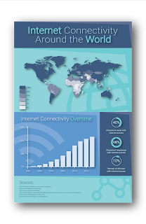
This next one is my favorite project we've done so far. I made my infographic over Internet Connectivity Around the World. The idea behind this is that over half of the world is still without internet, and I believe that we should fix that. The whole project took a few weeks to do, and I'm very happy with the result. A lot of people seemed to like it, some feedback I received was regarding the header and the text inside. So I messed around with the way the text aligned and I think it turned out well. I really can't wait to get it printed out full-size, I'm likely going to hang it up in my room once I get it.Massimo Vignelli
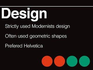
Finally, we did a research project over the history of graphic design. We were each assigned either a style of graphic design, or an artist. I was given a couple weeks to research and create a presentation over Massimo Vignelli. I didn't know much about him before doing this project, but I'm very glad I was assigned him. He did a lot to influence graphic design and designed many long lasting pieces still used to this day, a significant one being the signage for the New York Subway System. I received positive feedback on how well my presentation mimicked the style Vignelli used in a lot of his designs. I'm very proud of this project, I can't wait to present once we get back from break.How did you use your time in class?
I used my time in class effectively, I was often done with my projects before they were due, which left me time to improve and build upon them. Often times I would help my peers out with their projects if I was ahead and help them catch up. Outside of class, I often find myself looking at other designs, from people doing cool things with typography, to websites, and even architecture. I like doing this because I feel like it can make me a better designer and make me more creative. I'm also on the school's FIRST Robotics team, where my job is to create graphics for the team. This helps to keep me on my toes, the extra practice does a lot.
What are your ares of strength as an employee or graphic designer?
I say my biggest strength is creating layouts for designs. This helps me out with many aspects of life. It obviously helps out with graphic design, but I also find myself applying those skills when working on things like websites too. I like applying this wherever I can, not only to make my stuff look nice, but also to improve my skills.
What are your areas in need of improvement?
I wish that I was better at being creative overall. I want to get better at creating unique designs that look really cool. A goal of mine is to create a new logo that reflects who I am. My current one is a little too similar to other designs I've seen, so that's part of the reason I'm wanting a redesign.Summary
The thing I loved most about this semester was being able to have a teacher who could give me input on how to make my designs better and actually telling me why it looks better. I feel like the best way to learn anything is to have a mentor giving you input, so that's really helpful. I don't think I would do anything differently. My overall takeaway from this semester is that the hardest part about graphic design definitely is not actually using the program, it's being creative, at least for me. A goal of mine for next semester would be to learn how to mix fonts. I feel like that's a really useful skill to have, and it would help me out a lot, especially in web design.
Overall, I'm very happy with this class. It gives me a place to create and learn how to create higher quality works. I'm fairly certain that I will be continuing graphic design through my junior and senior years. As long as I'm creating, I'll be happy.
Monday, September 19, 2016
Hexcode Color Sampler
I made a website demonstrating how hex codes represent the colors that display on our computers. I added colors of the rainbow, a lighter version of the rainbow, and shades of gray. Here's a demo of what the colors looked like.
#e30000
#ee8800
Subscribe to:
Posts (Atom)