What did you do this semester?
This semester in graphic design has been very helpful for me. Though I came in to this class with quite a bit of prior knowledge in Adobe Illustrator, it was helpful to learn Photoshop as well. My skills with both programs have increased by quite a bit, as well as the quality of my designs. We did a few projects to help develop our skills, so I'll talk about each one.Learning Photoshop
 Our first project in this class was to learn Photoshop. We spent a couple weeks following tutorials that would teach us how to use and apply certain tools. A challenged I faced was working with clipping masks. Before these tutorials, I used to just erase what I didn't want of a picture instead of clipping it out. I was just so used to doing it that way, but using clipping masks is a lot better because you still have the rest of the image if you ever need it. I didn't really receive any feedback for this project since I was following a tutorial the whole way through.
Learning Illustrator
 After learning Photoshop, we started to work with Illustrator. We were given a tutorial to follow that would help us build a raccoon in a few days. After making my raccoon, we built a scene around it and printed out postcards. Since I had prior knowledge with Illustrator, I was able to work efficiently and had extra time to add some extra polish to my design. I really like how it turned out, the only challenge I faced was trying to think of an original theme for my Raccoon to be placed in. I was given a lot of positive feedback for this project, a lot of people seemed to enjoy it.
Vector Face
Once we finished our raccoon, we moved on to something a little more challenging. We spent a few weeks vectorizing our faces. It was a challenge to create an accurate depiction of myself that I was satisfied with. I learned that making hair in Illustrator is VERY hard and I wasn't really satisfied with how it turned out, even though I spent many hours outside of school trying to make it look good. I used gradients to contour my face, which I feel was a mistake and people I showed agreed with me. I shouldn't have tried so hard to make it just like the photo, because it ended up looking unnatural. I wish I would've had time to change it, but I ran out of time. I do like how it turned out though. I actually made a stencil version and I carved a pumpkin with my face on it for Halloween.Infographic
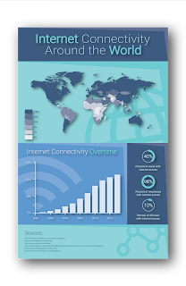
 This next one is my favorite project we've done so far. I made my infographic over Internet Connectivity Around the World. The idea behind this is that over half of the world is still without internet, and I believe that we should fix that. The whole project took a few weeks to do, and I'm very happy with the result. A lot of people seemed to like it, some feedback I received was regarding the header and the text inside. So I messed around with the way the text aligned and I think it turned out well. I really can't wait to get it printed out full-size, I'm likely going to hang it up in my room once I get it.
Massimo Vignelli
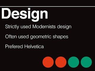
 Finally, we did a research project over the history of graphic design. We were each assigned either a style of graphic design, or an artist. I was given a couple weeks to research and create a presentation over Massimo Vignelli. I didn't know much about him before doing this project, but I'm very glad I was assigned him. He did a lot to influence graphic design and designed many long lasting pieces still used to this day, a significant one being the signage for the New York Subway System. I received positive feedback on how well my presentation mimicked the style Vignelli used in a lot of his designs. I'm very proud of this project, I can't wait to present once we get back from break.
How did you use your time in class?
I used my time in class effectively, I was often done with my projects before they were due, which left me time to improve and build upon them. Often times I would help my peers out with their projects if I was ahead and help them catch up. Outside of class, I often find myself looking at other designs, from people doing cool things with typography, to websites, and even architecture. I like doing this because I feel like it can make me a better designer and make me more creative. I'm also on the school's FIRST Robotics team, where my job is to create graphics for the team. This helps to keep me on my toes, the extra practice does a lot.
What are your ares of strength as an employee or graphic designer?
I say my biggest strength is creating layouts for designs. This helps me out with many aspects of life. It obviously helps out with graphic design, but I also find myself applying those skills when working on things like websites too. I like applying this wherever I can, not only to make my stuff look nice, but also to improve my skills.
What are your areas in need of improvement?
I wish that I was better at being creative overall. I want to get better at creating unique designs that look really cool. A goal of mine is to create a new logo that reflects who I am. My current one is a little too similar to other designs I've seen, so that's part of the reason I'm wanting a redesign.Summary
The thing I loved most about this semester was being able to have a teacher who could give me input on how to make my designs better and actually telling me why it looks better. I feel like the best way to learn anything is to have a mentor giving you input, so that's really helpful. I don't think I would do anything differently. My overall takeaway from this semester is that the hardest part about graphic design definitely is not actually using the program, it's being creative, at least for me. A goal of mine for next semester would be to learn how to mix fonts. I feel like that's a really useful skill to have, and it would help me out a lot, especially in web design.
Overall, I'm very happy with this class. It gives me a place to create and learn how to create higher quality works. I'm fairly certain that I will be continuing graphic design through my junior and senior years. As long as I'm creating, I'll be happy.

No comments:
Post a Comment