Pages

Wednesday, May 23, 2018

Semester Reflection

Accomplishments

Magazine Spread

The magazine spread was an interesting project where we had to interview a professional designer and design a magazine spread reflective of their style. The project took around a month to complete, however the class ran into a substantial problem when we lost nearly all our progress due to server issues. I learned that due to the possibility of a catastrophe like this, it's important to keep backups of our files. I'm happy with the design of it, however I feel as though it would've been significantly better if I had not run into issues along the way. In the future, I will keep backups of all my files.

Prom Poster

The design for our school's prom poster was a friendly competition for our class. The theme was "A Touch of Jazz". We designed posters and tickets for the theme. It took roughly three weeks from start to finish. A struggle I ran into was knowing when to stop adding the small details and focus on the picture as a whole. I found myself worrying about small elements more than I should've, and once I noticed that, I redirected my focus on to the picture as a whole. I'm very happy with the final outcome, my favorite aspect of the poster is the neon effect, I feel as though I've really mastered that effect; it looks fairly realistic.

Robotics Projects

As a part of my robotics team, I design many different products. This semester, I worked on a t-shirt, and multiple posters. I'm very happy with all of these. A problem I ran into however was forcing myself not to spend too much time on just one project. I would've loved to continue refining each poster, but I learned to make sure each individual poster got the time it deserves. Very happy with all of these projects.
Project 1
Project 2
Project 3
Project 4

Branding Project

Our final project had us all create fictional companies and the branding around them. My company was called "Hello Space!" where customers can buy tickets to space. I didn't run into many problems with this one besides the recurring struggle to decide exactly what percentage of my time each individual item should get. I'm getting much better with making those decisions, however. I'm very happy with the outcome of this project.

Time Management

I would like to say that I managed my time well in this class. I personally feel that although I did spend time talking to others, I've been better about still making progress and not getting completely off track as to result in no progress while I'm communicating with others. I did have to miss many days this quarter due to school-trips and also a number due to a wrist injury, though I always made up for what I missed by working on stuff after school. I allotted a significant time outside of class woking on items not assigned in this class, such as the posters for robotics.

Strengths

I'd say my biggest strength is still the technical aspect of designing. I know Illustrator like the back of my hand and am confident that I know the most efficient way to utilize a large majority of the tools in Illustrator. Other aspects of designing are still not as strong as my technical skills, but they are catching up. I find myself having continually more creative ideas as I learn to utilize sketching better and knowing how to find solid inspiration for projects.

Weaknesses

My biggest weakness would be communicating with my peers aside from the ones who are already close. Having a wider range of critiques makes for a better project, so this is something I need to work on.

Summary

The best thing about this semester for me was watching my creative process grow. Before, I had began to worry that my imagination had stagnated, though now I'm the most creative I've ever been. What I would change, and what I will do more of is sketching. Sketching is very important because you aren't constrained to a mouse and keyboard, where it's very hard to let your imagination apply itself to full capacity. Overall, I'm very proud of my growth this semester and look forward to the future.

Monday, December 18, 2017

Semester Reflection

What did I do this semester?


Name Typography

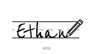
The name typography project consisted of displaying my name in twelve different ways to show different aspects about me. It took a couple of weeks to nail down the twelve ideas, starting from a broader list and funneling it down to the final twelve. For some of the names, it was really hard to create a design I was satisfied with. Some of them I really wish I could've done more with, but it this was a learning process within itself. Some of the solutions I came up with, I would've never thought about during brainstorming. I found myself focussing in on certain ideas for some, and not being satisfied unless it met that idea. But then I found that taking a step back and approaching it from another angle helped me overcome this. A design like this was the writing one. I actually spent maybe half an hour brainstorming and creating it in illustrator, but I think it's my favorite design of the project, and a lot of my peers agree with me. 

Having feedback on this project helped me a lot. My peers told me what they thought looked good, and also helped guide me to the conclusion that some of my prototype designs were just not working and that it was time to move on. It was really helpful to have this guidance. Once I accepted their advice, I threw out my designs that lacked the structure I needed and created something better. This project was helpful in getting me to think about my designs in a creative and more abstract way, and I think it was beneficial for my skills as a designer overall.


Hand Typography

The hand typography project was one of the hardest projects I've ever done. We had to create a greeting card with a hand drawn design. When we were done with the design, we would scan it in and format it on the computer. I wasn't expecting it to take as long as it did. It was extremely challenging to have to redraw the design multiple times trying to get it perfect and symmetrical. It was too easy to bump a ruler as I was trying to draw a straight line or to push the paper out from under me as I'm trying to perfect a curve. But in the end I learned that even if it takes a long time to perfect, the final product can still be worth it. I learned to really enjoy using hand drawn designs, they provide an element of authenticity to the design that you really can't get with a keyboard and a mouse. 

As I was creating the project, I was rushing to get the design on to the computer because that's what I'm most comfortable with. After I was stopped and sent back to drawing on paper, I was able to create a design that was much more solid than what I had before. It lacked a lot of structure and there were many blaring errors I had made. I was planning on just correcting these in Illustrator, but that would've taken away from the design. I've grown to appreciate the process of hand drawn designs a lot more, and will be sure to use them in future projects.

Branding Project

For the branding project, we had to create the image of a fictional company given nothing more than a number, two letters, an animal, and a mineral. This was challenging to come up with even the idea of the company, but it was also nice at the same time because I could let my imagination run with the things I was given and create something much larger. It was the longest project we did this year by far. It was hard to come up with a good logo, as it's still something I struggle with to this day. I've learned that I try to get too complex with my logo designs. Once I settled for simpler shapes and ideas, I created something I was a lot happier with. This was in part due to the feedback I was given, and without it, I would have created a project with a much worse logo that would have looked like a mess when placed on the products.

I really enjoyed this project, and I think it may be my favorite that I've done in eComm. I really like being at the end result of it and looking at what I've created. We're cutting out designs that we sent to the printer and compiling a board displaying our fictional companies. It's really nice to be able to see it come to life the way it is.

How did I use my time in class?

My time in class was mostly productive, although in recent weeks I've found myself falling behind. With so much going on in and out of school, I need to manage my time better than what I have been. I haven't been making enough time for graphic design outside of class mainly, and I would definitely benefit from doing so. Graphic design takes a lot of work if you want to be able to create something that you're proud of. I've learned this from the times where I thought I was done with something, but on closer inspection, required a lot more work than what I had thought originally. Such as with the Hand drawn greeting card, if I hadn't have gone back and ironed out the mistakes, I would've ended with a much inferior project. Now I'm always trying to not say that I'm done with a project until it's time to turn it in, because I find that there's always a way I can improve it if I look carefully enough. Outside of projects for eComm, I spend upwards of fifteen hours a week on robotics projects, and lately I spend a bit of time making stuff for the restaurant I work at. I actually created the main t-shirts for this years robotics team, and I'm really proud of that. At work, I've been creating recipe cards for us to use in the kitchen because the old ones are worn and hard to read.

Strengths/Weaknesses

My strengths in graphic design are my creative and technical skills. I've learned to use Illustrator really well. I make an effort to learn new tools and such in illustrator as much as possible. I have a mentor on my robotics team who used to help me with using Illustrator, but now he says that my skills with it have surpassed his own, which I am really proud of.

My weakness is still my time management. I find it hard to focus in and use all the time I'm provided with. I find it especially hard to find time outside of school to work on graphic designs projects, but I am making an effort to overcome this, and hope to have a more organized schedule by the beginning of the next semester.

Summary

I'm happy with the way things are going this semester, because I feel like I'm making bigger projects now rather than simple postcards. It makes me happy to see my designs being printed onto physical posters and t-shirts. The thing I want to change most is setting aside some designated time everyday to work on my graphic design stuff when I get home from school. That's my take away and goal, is that I need to manage my time better and I will be a lot happier with the projects I make. Overall, I'm happy to see myself improving, and I really can't to see where it goes.

Thursday, May 25, 2017

Chrome Extensions


WhatFont

WhatFont is a chrome extension that tells you what fonts are used on the page. When you hover over an element on a page, it'll show you the name of the font. This plugin is designed for the use of designers who want to use a font that they find on a website somewhere.

To use the plugin, you simply click on the WhatFont icon, and now wherever you hover, you'll see the font used in that element.

This extension is very easy to use. I didn't need any instruction, it just worked. I would definitely recommend this plugin to anyone who finds themselves working with fonts.

HTTPS Everywhere

My next extension is HTTPS Everywhere. It does exactly what it sounds like: it makes sure you have an HTTPS connection on every site. This means that all information you send back in forth is in the Secure Socket Layer, so it's encrypted.

There's not much to say about this plugin, once it's installed, your information is protected from anyone trying to spy on you.

This extension doesn't take any learning. Even if someone doesn't know what SSL is, they'll still understand that this plugin helps protect their information.

LastPass

LastPass is a password protection service. With the extension installed, you have an easy way to store your passwords for a variety of sites. Your passwords are encrypted, so this is useful for anyone who's concerned about their security while browsing the web.

LastPass has many features, but it's easy to get started with storing passwords. You can simply add a new password with the plugin and use it the next time you visit the site.

LastPass is very easy to use, the developers made sure to make instructions easy to find and made the program very functional.Image result for lastpass screenshots

End of Year Reflection: Web Design

What Did I Take Away?

Technology

Technology is my biggest strength in eComm. I work with computers very well and I'm always learning new things. My skills with HTML, CSS, and the likes have grown since the beginning of the year. At the beginning of the year, I didn't have a great understanding on how webpages worked. I have a much better understanding now, and would consider my work up to industry standards. With technology, I learn best with experience.


Collaboration


There isn't a lot of room for collaboration in web design, but I would say that I collaborate by working with others and getting help when I need it, or returning that help.


Communication


In eComm, communication is key. I communicate with Mr. Olson when I have questions about web design. Sometimes my computer may be acting up, or my code may be buggy, but with communication, I can have those problems fixed.


Project Management


I'd say my project management is fairly strong. Intend to get stuff in on time, although sometimes I think that I spend way too much time trying to make my projects something they don't need to be, for example, with my CSS Transition project, I was originally gonna do something completely different and harder than what was assigned. I wasted a lot of time on this, and it was turned in late.


Leadership


I like to exercise my leadership whenever I can. I think it's one of the most important guarantees that eComm offers. I try to show leadership by helping out my classmates when they need it. I have put a lot of time into web design outside of school, so I like to use my skills to help people who don't understand it as well as I do.


Strengths and Weaknesses


My biggest strength in eComm is my technology usage by far. I have really developed my skills when working with the coding languages we use. I've definitely improved on this throughout the year as well, this is due to the amount of time I've spent working with them. However, there's always more to learn, like PHP and MySQL. These languages are a lot different than HTML and CSS, so it's going to be a big challenge.

A weakness for me would probably be my communication skills. Although I feel like they have improved, I feel like I need to reach out more. I can do this by pushing myself to do it more next year.


APPLYING WHAT I'VE LEARNED

I think the skills I've learned will prove to be very valuable. I use my web design skills all the time in other aspects of my life, for example, I entered a portfolio in eMagine this year, and got second place.

CHANGES?

I don't think there's anything I would really change. eComm provides a great environment to grow one's skills. I really like how open-ended it is, and how it doesn't hold back people that are more advanced or leave behind anyone who doesn't quite get it. Everyone improves their skills all the time, and I really like that about eComm.

IN SUMMARY

In summary, eComm is a great learning experience. I'm glad that I have this opportunity, as my skills have grown immensely, and I feel like it has better prepared me for my future. The skills I learn in eComm prove to be very useful in other aspects of life, and I find myself applying them all the time. I love seeing the products that I have learned to produce, and how they've kept improving ever since I joined eComm.

Tuesday, May 23, 2017

End of Year Reflection: Graphic Design

What did I takeaway?

Technology

Technology is one of my biggest strengths in eComm. I know the programs that we work with very well and I'm always learning new things. My skills with Adobe Photoshop and Illustrator have definitely improved since the beginning of the year. At the beginning of the year, we worked on simpler projects, like the Postcard, but now I'm able to complete big projects like the Branding project. With technology, I learn best with experience, the more I work with a program, the more comfortable I am with it.

Collaboration

When collaborating in graphic design, we give each other critiques on our work. I'm very proud of my Infographic, I think it turned out really well, and this is in part to the feedback I received. It's always good to have someone else's input as they might see something that I don't. I try to help out the creators as much as I can, because I know that they also appreciate feedback. Critique's are very important when designing something.

Communication

Communication in eComm is another important factor. Communication is essential to being a successful employee. I try to enhance my communication skills by asking someone for advice when I'm stuck on something, whether it's design advice, or technology issues. For example, with the Branding project, I struggled with coming up with symbols that fit my brand well. But after talking to a few different people, I was able to get the ball rolling again. Effective communication boosts productivity by a lot.

Project Management

My project management skills have grown a lot. At the beginning of the year, I was kind of behind on projects like the Vectored Face project. As time went on, I was getting my stuff done sooner. I was able to complete the Branding project a day before it was officially due, in contrast to the Vector Face which was a few days late. This is in part to my increased technological skills, and also my improved creativity. Project management is extremely important, if you don't get stuff done on time, you're hurting yourself. If employees are behind on projects, they're going to upset clients and it will hurt their reputation.

Leadership

I use my leadership skills in graphic design to help my peers out with projects. For example, at the beginning of the year when everyone else was still learning Illustrator and Photoshop, I already had some experience and was able to spend more of my time helping others out with things they didn't understand. I hope I could help people a lot, because I know if I was struggling with something, I'd be more than willing to accept help in order to have a better project. Leadership is important because it helps everyone grow.

Strengths/Weaknesses

My biggest strength in eComm is my technology usage by far. I have really developed my skills when working with the all the programs. I've definitely improved on this throughout the year as well, this is due to the amount of time I've spent working with them. However, there's always more to learn, like new features I've never used before. These programs have a lot to offer in them, so it can be challenging to learn every aspect about them.

A weakness for me would probably be my communication skills. Although I feel like they have improved, I feel like I need to reach out more. I can do this by pushing myself to do it more next year.

Applying What I've Learned

I think the skills I've learned will prove to be very valuable. I use my graphic design skills all the time in other aspects of my life, for example, I'm able to make presentations that look very nice in my AP European History class. With good design skills, I'm able to present information in a more effective manner than I would have if I just through the text on the screen. Now I know how to pick good colors, fonts that serve my purpose well, along with other things.

Changes?

I don't think there's anything I would really change. eComm provides a great environment to grow one's skills. I really like how open-ended it is, and how it doesn't hold back people that are more advanced or leave behind anyone who doesn't quite get it. Everyone improves their skills all the time, and I really like that about eComm.

In Summary

In summary, eComm is a great learning experience. I'm glad that I have this opportunity, as my skills have grown immensely, and I feel like it has better prepared me for my future. The skills I learn in eComm prove to be very useful in other aspects of life, and I find myself applying them all the time. I love seeing the products that I have learned to produce, and how they've kept improving ever since I joined eComm.

Monday, May 22, 2017

Using Dreamweaver's Templates

This project as us working with one of the templates Dreamweaver has to offer. Instead of designing and coding the page from scratch like we have been, most of the designing was done for us, we just had to put the information in ourselves. A downside to this is that I had a hard time understanding what was going on in the code without careful examination. I know that nowadays, with websites as complicated as they are, it's often not worth the web designers time to design something from scratch. This is why companies like WordPress exist. WordPress offers thousands of different templates to choose from and requires next to no coding on the user's part. I would personally prefer to design my own templates so I understand what's going on in the webpage.

Tuesday, April 4, 2017

Responsive Design Overview

Responsive design is the practice of making your website adjust to the varying screen sizes of the website's viewers. This is important because people use their phones as much as they use full sized computers. Viewing a website designed for a different screen size can hurt the website's functionality by making it harder to read or use. I incorporated responsive design into my website in order to make it more usable on mobile. I did this by making the text larger relative to the screen on smaller screen. In addition, I made the array of projects have fewer columns on smaller screens.
On the desktop version of my website, we can see that the text on my splash page takes up about a third of the screen width. This looks really nice when viewed on a larger screen, but if it were to take up a third of a smartphone screen, it may become hard to read.
By using media queries, I changed the text so that it would use nearly 100% of the screen width. This works well on a small screen, but if it took up a 100% on desktop, it would be annoying to read.