This article talked about how much of an impact social media has on our everyday life. Once you post something, it's out there for everyone to see. This article spoke about how many colleges now look at the social media accounts of their applicants to see into their personal lives. Interviews with deans of admissions from various colleges reveals that roughly 31% of applicants were background checked using social media. And some social media posts have single handedly cause the applicant to ultimately be rejected from the school.
What Surprised Me
I was really surprised when I heard colleges check social media, and even more surprised when I learned that social media alone could result in an applicant getting rejected from the school. I shocked when I read that 31% of admissions offices did check social media, a number rising fast. Admissions offices are sometimes asked by students to look at posts of theirs, but it doesn't effect their chances as much as the social media checks do.
What Confuses Me
I was concerned when I read that it's possible for colleges to find someone else's account instead of the applicants actual account. Many people have the same names, so if someone who kept their social media in check applied for a college, but the admissions office checked someone who had the same name instead of the applicant, that could greatly hurt their chances.
Overview
After reading this article, I thought about how my own social media reflects who I am. I never post things I wouldn't be comfortable with other people seeing. After reading this article I will make sure that my social media remains a positive reflection of who I am.


 In this animation, I used techniques from the first one, but in a different, more realistic way. In the first one, the ball bounced infinitely, which isn't physically possible, so this one looses height with each bounce.


 I made this in Photoshop by following a tutorial. The tutorial taught me how to resize things properly, make things slightly transparent, and remove the white background from images. Photoshop is pretty different from Illustrator, Illustrator uses vectors but Photoshop is just pixels. That means you have to be more careful in Photoshop with your image scaling, if you scaled up a small picture to be bigger, it would be all pixelated, but in Illustrator, it would make more pixels. Both programs are useful in their own ways, you just have to know when to use them.
 I made this butterfly in Photoshop using the clone stamp tool. I didn't understand how it worked at first, but after it was explained to me it makes sense, it seems like a useful tool. I don't think they have this tool in Illustrator, so that's a difference between the two.
 I learned how to use the gradient tool, the text mask tool, and how to add strokes to the outline of a picture. Using all of those, I made this banner with a picture of the front of the school behind the letters, I also increased the saturation on the photo because I thought it looked nice.
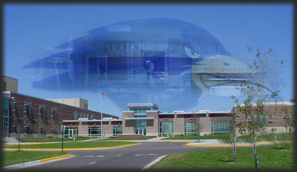 For my last Photoshop project, I used most of what I learned to make this. I copied the raven's head from the mural in the gym, pasted it on the picture of the school, lowered the opacity and added a soft light blend. Then I took pictures from around the school and applied layer masks to them to make them fade out around the edges and slightly transparent as well. This project used most of what I had learned about Photoshop and I think it turned out well.


