Pages

Tuesday, May 23, 2017

End of Year Reflection: Graphic Design

What did I takeaway?

Technology

Technology is one of my biggest strengths in eComm. I know the programs that we work with very well and I'm always learning new things. My skills with Adobe Photoshop and Illustrator have definitely improved since the beginning of the year. At the beginning of the year, we worked on simpler projects, like the Postcard, but now I'm able to complete big projects like the Branding project. With technology, I learn best with experience, the more I work with a program, the more comfortable I am with it.

Collaboration

When collaborating in graphic design, we give each other critiques on our work. I'm very proud of my Infographic, I think it turned out really well, and this is in part to the feedback I received. It's always good to have someone else's input as they might see something that I don't. I try to help out the creators as much as I can, because I know that they also appreciate feedback. Critique's are very important when designing something.

Communication

Communication in eComm is another important factor. Communication is essential to being a successful employee. I try to enhance my communication skills by asking someone for advice when I'm stuck on something, whether it's design advice, or technology issues. For example, with the Branding project, I struggled with coming up with symbols that fit my brand well. But after talking to a few different people, I was able to get the ball rolling again. Effective communication boosts productivity by a lot.

Project Management

My project management skills have grown a lot. At the beginning of the year, I was kind of behind on projects like the Vectored Face project. As time went on, I was getting my stuff done sooner. I was able to complete the Branding project a day before it was officially due, in contrast to the Vector Face which was a few days late. This is in part to my increased technological skills, and also my improved creativity. Project management is extremely important, if you don't get stuff done on time, you're hurting yourself. If employees are behind on projects, they're going to upset clients and it will hurt their reputation.

Leadership

I use my leadership skills in graphic design to help my peers out with projects. For example, at the beginning of the year when everyone else was still learning Illustrator and Photoshop, I already had some experience and was able to spend more of my time helping others out with things they didn't understand. I hope I could help people a lot, because I know if I was struggling with something, I'd be more than willing to accept help in order to have a better project. Leadership is important because it helps everyone grow.

Strengths/Weaknesses

My biggest strength in eComm is my technology usage by far. I have really developed my skills when working with the all the programs. I've definitely improved on this throughout the year as well, this is due to the amount of time I've spent working with them. However, there's always more to learn, like new features I've never used before. These programs have a lot to offer in them, so it can be challenging to learn every aspect about them.

A weakness for me would probably be my communication skills. Although I feel like they have improved, I feel like I need to reach out more. I can do this by pushing myself to do it more next year.

Applying What I've Learned

I think the skills I've learned will prove to be very valuable. I use my graphic design skills all the time in other aspects of my life, for example, I'm able to make presentations that look very nice in my AP European History class. With good design skills, I'm able to present information in a more effective manner than I would have if I just through the text on the screen. Now I know how to pick good colors, fonts that serve my purpose well, along with other things.

Changes?

I don't think there's anything I would really change. eComm provides a great environment to grow one's skills. I really like how open-ended it is, and how it doesn't hold back people that are more advanced or leave behind anyone who doesn't quite get it. Everyone improves their skills all the time, and I really like that about eComm.

In Summary

In summary, eComm is a great learning experience. I'm glad that I have this opportunity, as my skills have grown immensely, and I feel like it has better prepared me for my future. The skills I learn in eComm prove to be very useful in other aspects of life, and I find myself applying them all the time. I love seeing the products that I have learned to produce, and how they've kept improving ever since I joined eComm.

Monday, May 22, 2017

Using Dreamweaver's Templates

This project as us working with one of the templates Dreamweaver has to offer. Instead of designing and coding the page from scratch like we have been, most of the designing was done for us, we just had to put the information in ourselves. A downside to this is that I had a hard time understanding what was going on in the code without careful examination. I know that nowadays, with websites as complicated as they are, it's often not worth the web designers time to design something from scratch. This is why companies like WordPress exist. WordPress offers thousands of different templates to choose from and requires next to no coding on the user's part. I would personally prefer to design my own templates so I understand what's going on in the webpage.

Tuesday, April 4, 2017

Responsive Design Overview

Responsive design is the practice of making your website adjust to the varying screen sizes of the website's viewers. This is important because people use their phones as much as they use full sized computers. Viewing a website designed for a different screen size can hurt the website's functionality by making it harder to read or use. I incorporated responsive design into my website in order to make it more usable on mobile. I did this by making the text larger relative to the screen on smaller screen. In addition, I made the array of projects have fewer columns on smaller screens.
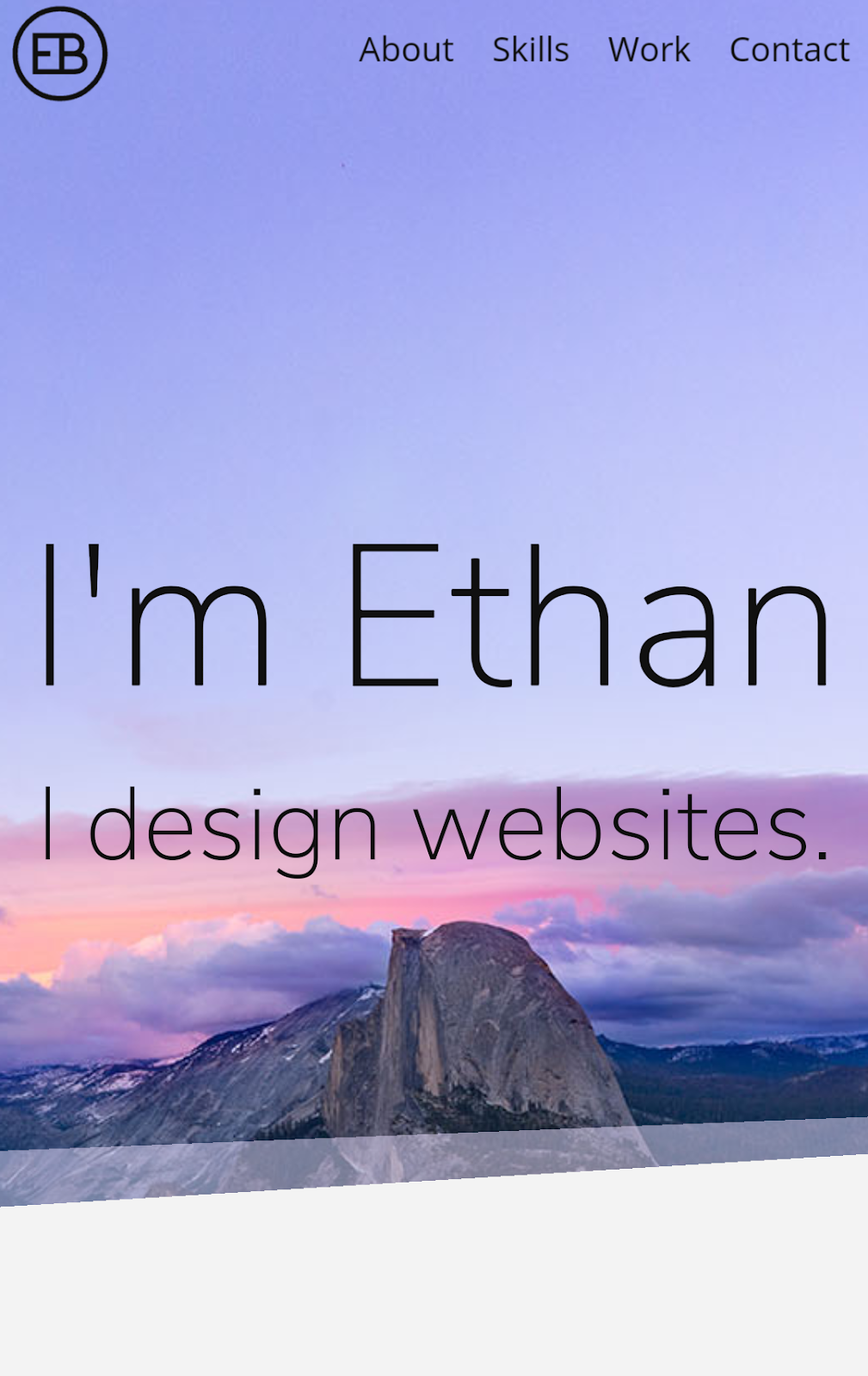
On the desktop version of my website, we can see that the text on my splash page takes up about a third of the screen width. This looks really nice when viewed on a larger screen, but if it were to take up a third of a smartphone screen, it may become hard to read.
By using media queries, I changed the text so that it would use nearly 100% of the screen width. This works well on a small screen, but if it took up a 100% on desktop, it would be annoying to read.

Sunday, April 2, 2017

Responsive Design


Responsive design in websites is when the website you're viewing adjusts to the screen size in order to convey the message most effectively across devices. The amount of people viewing websites on mobile devices is increasing, so now it's important to account for desktop and mobile users. The best way to do this in web design is by using media queries. Media queries can be used to apply certain CSS styles only when the viewing width of the page fits within the limits of the media query. When developing a responsive design, you have to pay attention to breakpoints. You can find breakpoints by slowly decreasing your window's width until the elements on the page don't look like they should. This is where you insert a media query. By continuously finding and fixing breakpoints, you can make a website responsive.


This is a screenshot from the laptop version of Papa John's site. This screenshot has the most information on the page as possible.
When shrunk down to the tablet size, the site retains most of the same elements. One change is the removal of the promo code bar and the reduced size of the shopping cart button.

Finally, the smallest version has a hamburger menu which you can expand to see the remaining navbar content. The splash content was also reorganized to move the text under the picture instead of covering it in order to use the space most effectively.

Thursday, March 23, 2017

Marks and Symbols

In the world of graphic design, marks are used frequently. There are different classifications of marks, and we learned how to distinguish between them today. The first type of mark is the symbol. Symbols are marks without type that identify a group and can be legally protected. These make a quick impact, however they have to be explained due to the lack of type explaining the mark. Pictographs are public symbols able to be used by all. These are often associated with public safety. Lettermarks are letters used to identify a company that aren't pronounceable. These are often shortened versions of a longer name. Logos are words that represent a company but are pronounceable. Combination marks are a combination of a symbol and logo, also called signature. Finally,we have trademarks. All of the previously mentioned marks qualify to be trademarks. Trademarks are the legal name for unique mark. These can be registered and protected by the law.

The difference between a symbol and a logo is that a logo uses type to represent a company, and a symbol represents the company without any type. When the two of these are used together, a combination mark is created.

I learned that there is a difference between a logo and symbols. I had never paid any attention to the distinguishing factors between these. I also had never realized that lettermarks were separate from logos as well. In addition, pictographs were new to me. I didn't know that there were separate names for symbols not protected by the law.

My favorite thing I learned would just be learning the classifications in general. I feel like this would be useful when working with clients and designing the right type of mark for them.

Thursday, February 9, 2017

Flash

    In it's prime, Flash helped give life to the websites we visited. Instead of just a GIF or flashing text, you could make your website much more interactive. The use of this plugin would ensure that a website would load exactly the same way for everybody who visits the page. With Flash, we saw the beginning of web based video, animations, and games.

    When the first iPhone was announced in 2007, Apple also announced that the iPhone would not offer Flash support. The functionality lost as a result of this was not much of an issue, as the release of HTML5 was imminent. HTML5 would replace some of the functionality Flash offered, so developers began to move away from Flash. Later, in 2010, Steve Jobs published a note on his website justifying his reasoning for not supporting Flash. This plugin was insecure and resource-intensive, and Jobs believed that it's better to use open standards, like HTML, CSS, and JavaScript.

    Despite this, Android still supported Flash, and you could still develop native apps for iOS. And on the web, many of Facebook's games were made on flash, and YouTube used Flash for video playback. However, HTML5 would soon be able to support video on YouTube. The idea of a plugin free internet was spreading. In 2011, Adobe stopped the production of the Flash Player for Android and released Edge Animate, a new way to create HTML5 content, which only made Flash more obscure.

    In 2015, Adobe discontinued Edge Animate and renamed Flash to Animate CC. Now it would be the “premier web animation tool for developing HTML5 content while continuing to support the creation of Flash content".

    Facebook became one of the last big users of Flash, however they were looking for an alternative. They had tried to create a library of HTML5 games in 2011, but quickly shut down the project. Although they are trying to distance themselves from Flash, their library of games is still up and running.

    In an effort to move away from flash, Google has announced that from now on, Chrome will block Flash by default, with the goal of eventually blocking Flash altogether. I feel like Flash doesn't have a future on the internet. The alternatives have become used even more, and are beginning to perform better than Flash.

Monday, January 23, 2017

Designing Posters

The Character and Function of a Poster

    In graphic design, posters are used to spread ideas. This idea can be anything from advertising a product to propagating a political campaign. In order to spread the idea, you want to maximize the amount of people looking at your poster. This can be done by printing multiple copies, but in a world where we're bombarded with a constant flow of information, you have to create an eye-catching poster to get any attention. Most posters go unread because they fail to do this.

The Laws of Poster Design

    Creating a poster that will get attention can be extremely challenging. There are many aspects that go in to making a great poster. Overall, a poster must be legible, easily understood, and interesting. It's helpful to make your poster large in order to increase the distance at where it can be read. The lettering on the design is also a vital detail to pay attention to. The font has to be easy to read, and properly integrated with the style of the poster. Even the writing itself should be concise and simple.

    The use of shapes in poster design is really important as well. When properly used, shapes give your design a sense of rhythm. Shapes are responsible for bringing attention to the poster, so you want to make sure that you're using them properly.

    Lastly, but definitely not least, is color. It shouldn't be much of a surprise that color is extremely important in any form of design. For your poster, you want to make sure the colors catch the readers eye. You have to be careful not to use too much color however, as this can make it hard to comprehend the information on the poster. Use color theory to your advantage, and choose a palette that will really help get your message across.

The Keys to a Great Poster

    I believe that the most important aspects to a good poster are the color, placement, and the information. The color and placement are what helps to get attention of the reader. As I wrote before, the colors must stand out, but not be too overwhelming. The placement refers to the size and location of the poster. You want to place your poster in a place where people who are interested in the topic may be gathered. The size is also important, the larger your poster, the greater the distance people can read the information from. Now that you have the attention of the viewer, you want to get the information to them in the most concise way possible. You don't want to hit your viewer with a huge wall of text, or they are likely to just ignore it and move on.

What I learned

    The most important thing I learned from this article was how to get the attention of your audience. You have to make a poster that stands out from the rest, and once you have that attention, you have to know how to maintain it. This can be applied to many aspects of life, not just poster design.